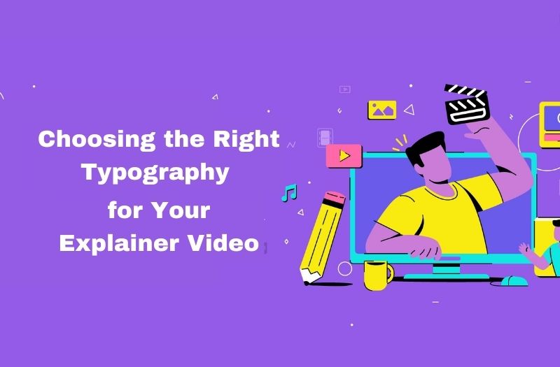
Typography is a necessary element of any explainer video, as it plays an important role in communicating the message to the target audience in an appropriate manner. Typography refers to the use of fonts, typefaces, and other visual components to convey information in a more efficient and creative way. Selecting the right typography for an explainer video is important to make sure that the message is conveyed efficiently and engagingly.
In this article, we will discuss the tips and tricks in detail for selecting the right typography for an explainer video.
1. Determine the purpose of the explainer video:-
Before you begin choosing typography for your custom explainer video, it is necessary to have a clear understanding of the goal of the explainer video. What message do you want to communicate to the target audience? What is the mode of the video? Determining the goal of the explainer video will support you in choosing the right typography that complements the message and tone of the explainer video.
2. Consider your brand identity:-
The typography that you will use in your explainer video should be in accordance with your brand identity. The typography you select should match your colors, and logo of your brand. This will support your video to appear like a development of your brand, creating it more memorable and definite.
3. Readable fonts:-
Readability is important when selecting typography for an explainer video. You want your target audience to be able to read and understand the text of your content on your website without stretching their eyes or getting disturbed by excessively ornate fonts. A typography that is simple to read will assist the intended audience engage with the video and maintain the information in a better way.
- Sans-serif fonts such as Helvetica, Arial, and Roboto are basically considered to be the most readable for screen use. These font styles are simple to read, have a clear and contemporary appearance, and can be utilized for both headings and body text in the content.
- Serif fonts such as Times New Roman or Georgia are well suited for print materials like books, newspapers, and magazines etc because Serif fonts have small strokes, or serifs, at the end of each letter that create these fonts more readable in printed materials but difficult read on screens.
4. Understand your target audience:-
Before you start choosing typography for your explainer video, it is necessary to understand your target audience. Think about their age, interests, and cultural background. For instance, in case that your target audience is millennials or generation Y, you may want to use a modern, clear font style that displays the recent design trends. Although, if your intended audience is more traditional, you may want to utilize a serif font that has a more classic feel. determining your target audience will support you in selecting the right typography style that resonates with them.
5. Keep the typography simple:-
Typography should be simple to read and understand. Do not use fancy fonts or excessively complicated designs that can divert the visitor from the message. Rather, use clear, legible fonts that are easy on the eyes. The size of the font should also be large enough to read easily, but not so large that it affects the viewer. Utilize bold and italic font styles gently to reinforce essential points and break up large blocks of text.
6. Create contrast:-
Creating contrast is important to creating visual appeal and guiding the eye of viewers. This can be accomplished by utilizing various types of font sizes, colors, and weights. For instance, you can utilize a larger font for headlines and a smaller font for body text. In the same way, you can use various types of color palettes to make contrast and emphasize important text. Although, pay attention not to utilize too many different fonts or color schemes as this can make tangle and distract from the message.
7. Utilize animation:-
Animation can include visual interest to your typography and assist to communicate your message more efficiently. For instance, you can animate your typography to emphasize significant text or make visual transitions between different sections of the explainer video. Although, be careful not to exaggerate it, as too much animation can be confusing and take away from the message.
8. Be consistent:-
Utilizing consistent typography throughout your explainer video is necessary to making a balanced look and feel. This consists of using the same font styles, font size, and color palettes throughout the explainer video. Consistency supports the viewer to concentrate on the message instead of being confused by changes in typography.
Typography trends for explainer videos:-
Typography trends for explainer videos are continuously changing and developing as new design trends come into view. However, some typography trends have stayed famous in current years, and here are some tips and tricks for selecting the right typography according to trends for your explainer video:
- Bold Typography:
Using thicker fonts to enforce important points or make a strong visual arrangement that guides the viewer through the content on your explainer video.
- Handwritten Typography:
Utilizing fonts that have a handwritten or hand drawn appearance to produce a more personal and accurate feel, which can be efficient for brands that want to communicate a more human touch.
- Minimalism:
Utilizing simple, clean font styles with a large number of white spaces to make a sense of grace and composure.
- Custom Typography:
Generating your own fonts or lettering particularly for your explainer video to make an exceptional appearance and feel that emerge from the competition.
- Mixed Typography:
Using various types of fonts in the same design to make contrast and visual appeal.
- 3D Typography:
Creating text that looks to be three-dimensional to make a sense of depth and linearity.
- Dynamic Typography:
Animating the text of the content to make movement and visual appeal to make a more appealing and interactive experience for the viewer.
Conclusion:
When selecting typography for your explainer video, it is necessary to think about your brand identity, intended audience, and the message that you want to communicate to your audience. By implementing up-to-date with recent design trends and experimenting with various typography styles, you can produce an efficient explainer video that engages with your target audience.